Ever clicked on a subtle tooltip, got a product tour pop-up, or saw a message appear while using an app?
That’s in-product messaging.
It’s how great products guide users, reduce friction, and drive action, all without sending an email.
In this guide, we’ll break down what in-product messaging is, the different types, real examples, and how to implement it the right way to boost engagement.
What Is In-Product Messaging?
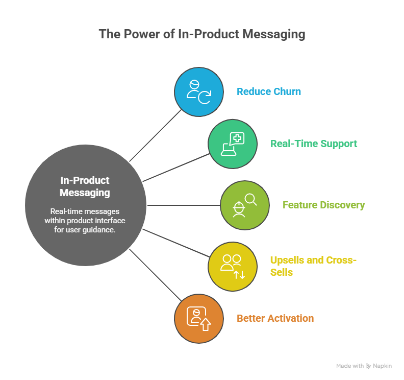
In-product messaging is the messages users receive inside your product or app interface. These messages appear while users are actively interacting with the product and are usually triggered by behavior, milestones, or specific actions.
But it’s just as important to understand what in-product messaging is not.
They’re not push notifications or emails, they’re real-time, contextual, and embedded in the user journey.
Why You Need In-Product Messaging
It’s one of the most effective ways to guide your users without pulling them away from what they’re doing.
- Reduce churn: Re-engage slipping users right inside the product
- Real-time support: Address confusion or errors as they happen
- Feature discovery: Encourage usage of underused tools
- Upsells and cross-sells: Nudge users when it’s relevant
- Better activation: Walk new users to their first success faster
How to Do In-Product Messaging (Step by Step with Lindy)
A solid in-product messaging system should help deliver timely, contextual, and helpful guidance across the user journey.
Step 1: Map Out Key User Journeys
Start by mapping the core flows your users follow, like:
- Onboarding
- Feature discovery
- Trial-to-paid conversion
- Upgrade paths
- Retention behaviors.
These flows highlight the moments that matter most, and your in-product messages should be designed to support users at each of these points.
In Lindy, you can define user journeys using triggers based on real-time behavior. For example, create a Lindy agent that monitors whether users complete onboarding, visit the pricing page, or engage with specific features.
These journeys become programmable flows, where each step can trigger a personalized message or escalation.
Step 2: Choose Key Moments To Intervene
Next, identify where users drop off or slow down. Maybe they skip step 2 of onboarding or repeatedly visit a feature without using it. These are moments where a subtle nudge like a tooltip, modal, or inline message can move them forward.
Set up behavioral triggers directly in Lindy. If a user doesn’t complete setup within 48 hours, your Lindy agent can trigger a friendly checklist or contextual message.
Lindy can also fetch data from analytics tools like Mixpanel, Amplitude, or Segment to identify high-friction moments and respond automatically inside the product.
Step 3: Segment Your Users
Not all users need the same message. First-time users might need tutorials, power users want shortcuts, and inactive users need reminders. Segment your users by lifecycle stage, usage patterns, or plan type to deliver tailored experiences.
Lindy lets you create conditional logic based on user properties and behavior. You can segment users dynamically like free vs. paid, engaged vs. dormant, new vs. loyal and assign different Lindy agents or message flows to each segment.
Integrations with tools like Notion, Google Sheets, or your backend let you pull in custom user attributes easily.
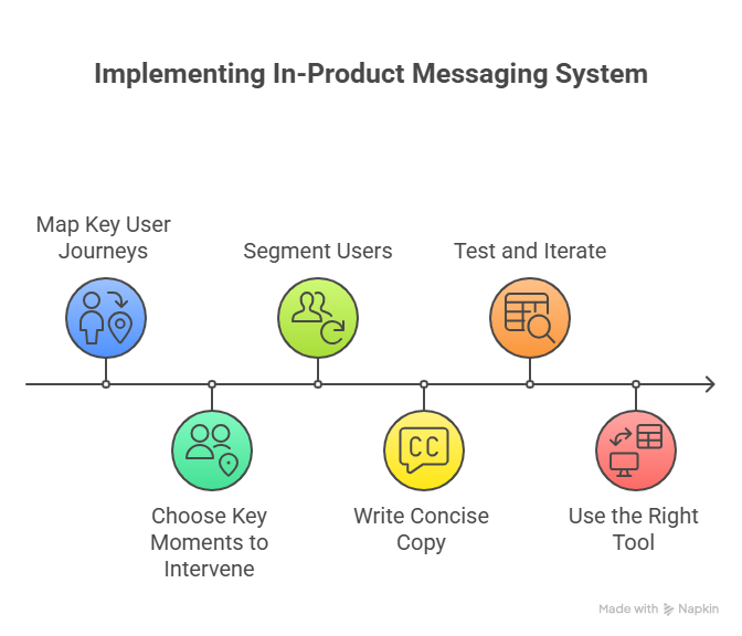
Step 4: Write Helpful, Concise Copy
Your messaging needs to be super clear. Each message should be short, conversational, and focused on one action. Avoid long instructions or marketing speak.
Think like a product teammate: “Click here to finish setup” or “Try this shortcut for faster results.”
You can use Lindy to customize message copy per trigger, user segment, or channel. You can test multiple versions of the same message (via A/B paths) and see what gets the best engagement.
Each Lindy agent can deliver messages in your tone of voice, keeping your brand experience consistent across tooltips, banners, and slideouts.
Step 5: Test and Iterate
Don’t set it and forget it. Track how users respond to your messages. Are they engaging, ignoring, or closing them? Use data to improve wording, placement, and timing. A/B test different formats to see what drives actions.
You can track every interaction a user has with your in-product messages inside Lindy. It gives you clear metrics like view rate, click-through rate, completion rate, and drop-off points.
You can even export this data to Google Sheets or sync it to dashboards via Zapier or custom APIs.
Step 6: Use the Right Tool
You need a platform that handles behavioral triggers, message delivery, segmentation, and analytics, all without requiring constant engineering support.
That’s where Lindy stands out.
It acts as your no-code automation layer for in-product engagement. You can build intelligent, real-time messaging agents that react to user behavior and coordinate across tools.
Lindy integrates natively with Intercom, Slack, Notion, Google Sheets, and even your product backend, so your in-app messages are part of a broader workflow, not a siloed add-on.
{{templates}}
Common Types of In-Product Messaging
In-product messages come in many formats, and each one plays a different role in shaping the user experience.
Whether you're guiding someone through their first setup or announcing a major update, choosing the right format matters just as much as the content itself.
Here are the most common types of in-product messaging and when to use them:
1. Embedded Messages
These are passive hints or short notes built directly into your product interface, like next to buttons, under headings, or alongside data. They don’t interrupt the user but provide helpful context as they move through the app.
Use them when you want to support users without requiring them to take immediate action, for example, a line of text below a form field that explains input rules.
2. Tooltips
Tooltips are small, contextual pop-ups that appear when a user hovers over or clicks an element. They're perfect for explaining non-obvious UI elements without cluttering the screen.
Use tooltips when onboarding new users or revealing hidden features. They’re lightweight, targeted, and work best for explaining small interactions in the moment.
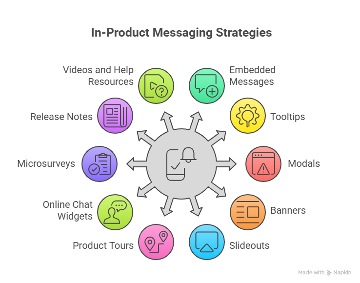
3. Modals
Modals take over the interface temporarily and require the user to engage before continuing. They’re designed to command attention and are ideal for delivering critical information or prompting an action.
Use modals when welcoming new users, prompting important upgrades, or announcing policy changes, just don’t overuse them or they’ll feel intrusive.
4. Banners
Banners are static, horizontal strips that appear at the top or bottom of the screen. They’re visible but unobtrusive, ideal for broad, non-urgent messages.
Use banners for announcing maintenance windows, promoting seasonal discounts, or sharing passive updates users might want to dismiss.
5. Slideouts
Slideouts are side panels that expand from the edge of the screen. They offer more space than tooltips or banners and can contain text, buttons, or even media.
Use slideouts when you want to provide richer guidance, like showing a multi-step checklist or upsell offer, without hijacking the whole screen.
6. Product Tours
Product tours are guided flows made up of tooltips, modals, and hotspots. They help users navigate through your product step-by-step.
Use product tours to onboard new users or introduce a newly released interface. But avoid rigid, one-size-fits-all tours, users should be able to skip, pause, or choose their own path.
7. Online Chat Widgets
Live chat embedded in your product lets users ask questions or get help in real time, without leaving the page. It’s a direct line to your team.
Use chat when users are likely to get stuck or need personalized support, especially during onboarding, setup, or billing.
8. Microsurveys
Microsurveys are short, in-app questionnaires that let you collect feedback in the moment. They’re usually just 1–3 questions and are often triggered by specific behaviors.
Use microsurveys to collect insights after a key action, like completing a task, abandoning a flow, or trying a new feature.
9. Release Notes & Product Updates
These are announcements shown inside the app to highlight new features, bug fixes, or improvements. They’re often embedded in dashboards or shown via modals or banners.
Use product updates to build transparency and let users know how your product is evolving, especially if updates reflect user feedback.
10. Videos and Help Resources
Embedded videos, GIFs, or help links can be placed inside modals, tooltips, or sidebars to explain complex tasks visually.
Use them to reduce support tickets and help users learn by seeing, not just reading.
Together, these messaging types give you a toolkit to guide users, collect feedback, and boost adoption, without forcing them out of the product experience.
Best Examples of In-Product Messaging (Across the User Journey)
Once you know the formats, the next question is: what should you say, and when?
The power of in-product messaging lies in meeting users exactly where they are in their journey, whether they’re just signing up, exploring features, or considering an upgrade.
Here’s how in-product messaging can show up at every key stage:
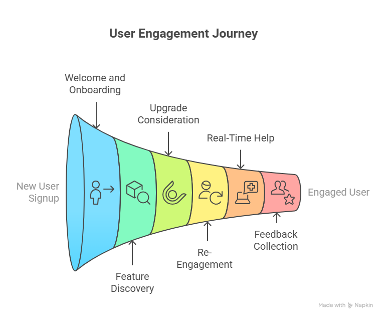
1. Welcoming and Activating New Users
The moment a user signs up, they need to feel guided, not overwhelmed. A warm welcome message, followed by a product tour or onboarding checklist, helps reduce friction.
Example: After account creation, show a welcome modal:
“Welcome to Flowly! Let’s get your first project up and running– it takes less than 3 minutes.”
Follow this with a product tour pointing to key features like "Create Project" or "Invite Team."
2. Driving Feature Discovery
As users explore, many won’t find your most powerful features on their own. Well-timed nudges can help them get more value from your product.
Example: A tooltip appears when the user hovers over a new dashboard filter:
“New! You can now filter tasks by assignee and due date. Try it here.”
This keeps discovery seamless, right when it’s most relevant.
3. Converting Free Users to Paid Plans
When users hit usage limits or show signs of long-term engagement, it’s the perfect time to prompt an upgrade.
Example: A slideout appears after completing 10 projects on the free plan:
“Looks like you’re outgrowing the free plan. Upgrade to Pro for unlimited projects and team access.”
You’re not interrupting; you’re offering value in context.
4. Re-Engaging Inactive Users
Users who go quiet often just need a reason to come back. The key is to show them what’s new or what they’ve missed.
Example: After a 30-day absence, a returning user sees a banner:
“We’ve added 5 new templates and team commenting since your last visit—take a look.”
It’s low-pressure and invites re-engagement without feeling salesy.
5. Offering Real-Time Help During Friction
When users are stuck or abandoning a flow, a timely message can turn frustration into progress.
Example: During integration setup, a chat prompt appears:
“Need help connecting your calendar? Talk to support or view the 2-minute setup video.”
You catch them right before they give up.
6. Collecting Feedback at the Right Moment
Feedback is most useful when it’s tied to action. Asking a user what they think immediately after a task gives you higher response rates and better data.
Example: After completing a report export, a microsurvey appears:
“Was this report easy to build? (Yes/No)” → “What could be better?”
Quick, relevant, and respectful of the user’s time.
7. Announcing Relevant Product Updates
When you release something new, tell the right users at the right time—not everyone all at once.
Example: A banner in the analytics tab for power users:
“Just launched: Time-based filters for custom reports. Check them out.”
It’s targeted and informative, without shouting.
Build Smarter In-Product Messaging with Lindy
In-product messaging works best when it's timely, targeted, and tied to real user behavior. Lindy makes that easy, without code or developer dependencies.
Here’s what you can do with Lindy:
- Trigger personalized messages based on real-time user behavior
- Segment users dynamically by plan type, lifecycle stage, or engagement level
- Launch tooltips, banners, modals, and slideouts from one visual interface
- Build multi-step onboarding flows that adapt to user actions
- A/B test message variants and track clicks, dismissals, and completions
- Integrate with tools you already use like Intercom, Slack, Notion, and Google Sheets
- Pull data from your product or CRM backend to personalize messaging at scale
Start building contextual, conversion-friendly in-product experiences today.
{{cta}}
Frequently Asked Questions
1. How is in-product messaging different from tooltips or product tours?
In-product messaging is a broader strategy that includes formats like tooltips, modals, banners, and product tours. Tooltips and tours are just delivery methods. The core idea behind in-product messaging is delivering helpful, timely guidance inside your app while users are active, based on their behavior and stage in the journey.
2. Can in-product messaging replace onboarding emails?
In-product messaging works well for real-time guidance, while onboarding emails help bring users back. You shouldn’t rely on one over the other. Combine both strategies to drive better activation. Use in-app messages to guide users once they log in and emails to re-engage users who haven’t returned yet.
3. What triggers should I use to show in-product messages?
The best triggers rely on user behavior and context. Trigger messages when users sign up, miss a key step, hit a usage limit, visit a feature but don’t engage, or return after being inactive. Tie each message to a specific action, goal, or friction point in the user journey.
4. How many in-product messages are too many?
If users frequently dismiss or ignore messages, you’re likely showing too many. Prioritize key interactions like onboarding, feature adoption, and upgrade opportunities. Avoid stacking multiple messages at once. Always give users control by allowing them to skip or close messages without blocking their experience or flow.
5. Do I need developers to set up in-product messaging?
You don’t need developers when using no-code tools like Lindy. You can set up message triggers, write copy, segment users, and create guided flows yourself. Lindy connects with your product data, CRM, and tools like Intercom or Notion so you can build everything without writing any code.
6. How do I know if my in-product messages are working?
You should monitor view rates, click-through rates, dismissals, and completions. These metrics show how users respond. Use A/B testing to find better wording or placement. Lindy lets you track and compare results in one place so you can keep improving engagement and user flow over time.
7. Should I write in-product messages differently for different user types?
Yes. New users need guidance and feature walkthroughs, while power users want speed and shortcuts. Inactive users may respond better to updates or reactivation prompts. With Lindy, you can segment users by plan, usage, or behavior and deliver personalized messaging for each user group automatically.
8. What makes in-product messages feel helpful instead of annoying?
Relevance, timing, and tone matter most. Make sure messages solve a problem or highlight a useful next step. Keep the copy short and actionable. Never interrupt a user in the middle of a task. Allow users to skip, close, or delay messages so they stay in control.
9. Can I personalize in-product messages?
Yes. You can use user data to personalize copy, timing, and message content. Lindy lets you pull in data from your CRM, product database, or spreadsheets. You can greet users by name, tailor messages to their plan, and trigger content based on feature usage or engagement patterns.
10. What’s the fastest way to get started with in-product messaging?
Start with a welcome message and a short onboarding checklist. Then add a tooltip to highlight one underused feature. Use Lindy to build these flows in minutes. Connect your product data and launch without coding. Once live, monitor results and expand your messaging based on user behavior.


.jpg)
.png)
.png)

.png)
.png)